
One of the most exciting things to choose when you start planning your wedding are your wedding colours. But this fun task can quickly become overwhelming, with so many options and palettes to choose from, how can you possibly decide?
The colours you select go much further than being the bridesmaids dresses and groomsmen attire choices. Your wedding palette will be infused into the floral design and reception tablescape design right down to the invitations (the first impression) and the guest favours (the lasting impression).
Here’s a few tips to help you decide on your perfect wedding colours.
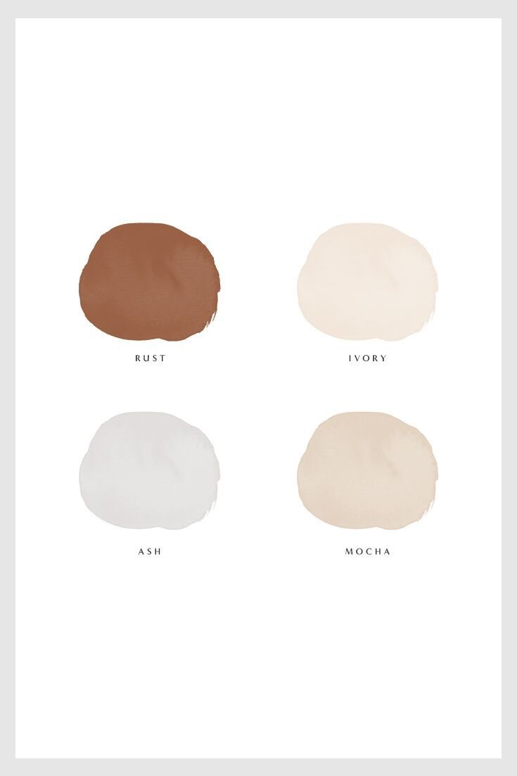
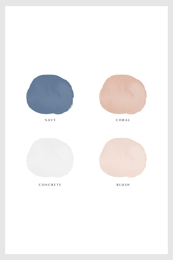
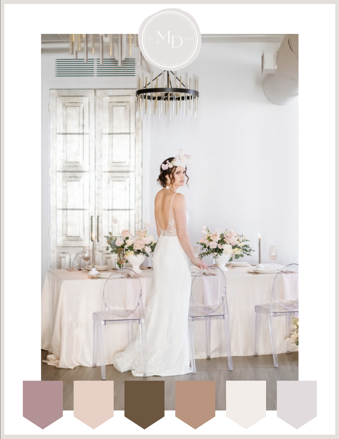
Consider Your Bases
Every good design needs a solid base to work up from which is why picking your base colour should be the first thing on your list. This can be a neutral tone like ivory or taupe or something bolder such as sage or merlot. From there, add in more complimentary colours (we recommend up to 4) and then one more as an accent colour.
Use your accent colour sparingly so as to not overwhelm the design or distract from the rest of the decor. A great way to use your accent colour (which are the rust and navy in the images) is in the napkin linens or with a few stems added to the centrepiece arrangements.
“Every good design needs a solid base…”
Consider The Season
Ever notice how the styles and the colours change in retail stores every season? Spring brings out pastels and pretty pinks, while Fall introduces shades of merlot, mustard and olive.
You can also take cues from the season to choose your wedding colours. Consider bright pops of yellow with shades of sand, taupe and stone to liven up a Summer wedding or opt for blush tones with an accent colour of deep red for your Fall wedding.
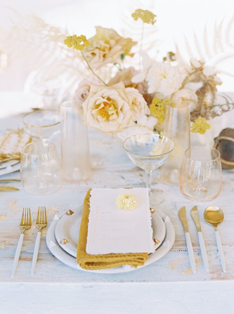
Photo by: Trynh Photo
Take our “Find Your Perfect Wedding Colours” Quiz to get you started
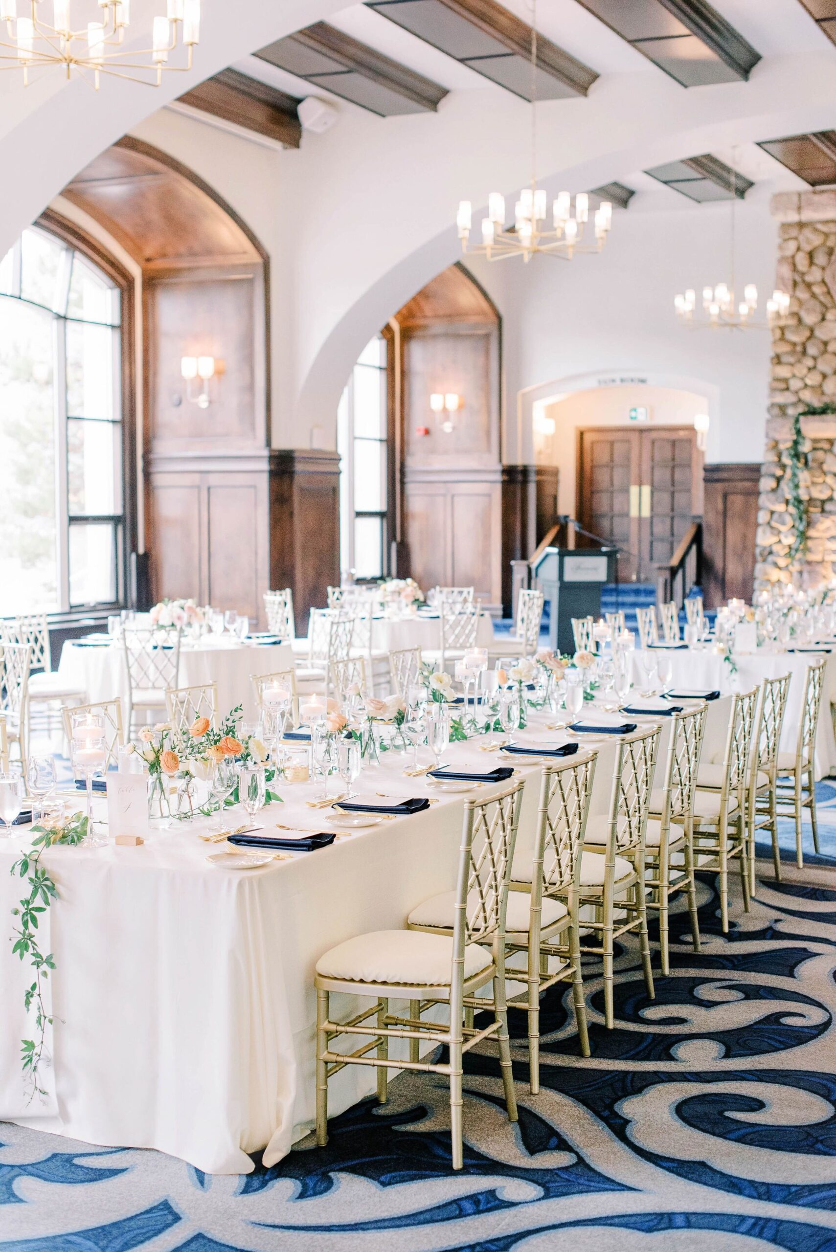
Photo by Kristyn Harder // Event by: Evelyn Clark Weddings
Consider The Venue
Some venues offer the perfect blank slate for you to design your dream wedding (think all white walls and wood floors), while others already have bold colours or staple decor pieces that need to be considered. A great example of this is the Fairmont Chateau Lake Louise which features a cerulean blue carpet and natural stone fireplace. It pairs well with neutral colours like ivory, white, and blush.
Consider The Colour Wheel
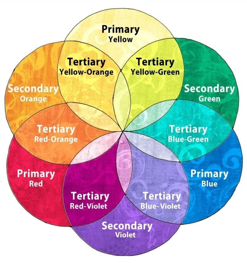
As designers, we use colour to create depth, texture, interest, and ambience. When deciding on your wedding palette, think about the colour wheel in regards to primary, secondary and tertiary colours that when used in accordance with the principles of colour theory, create a beautiful and harmonious colour palette that tell a visual story. When looking for complimentary colours you choose colours that are on opposite sides of the colour wheel such as purple and yellow or blue and orange. You can also go for an elevated look using analogous colours (aka a group of related colours that are near each other on the colour wheel) such as red, orange and yellow.
Still feeling overwhelmed? Take our “Find Your Perfect Wedding Colours” quiz, it may surprise you!
Good luck and as always, if you need any guidance, we’re happy to chat.


